Originally posted on Interhacktives
We all know that data visualizations can really bring an article to life. However, I’ve learned from experience that it’s easy to become so engrossed in making a data vis that you compromise the quality by overlooking key elements. Learn from my mistakes and make sure to knock these 7 things off your checklist before you click “publish!”
1. Pick the right chart or graph
A great visualization should be able to tell a story on its own, so it’s essential to make sure you’ve chosen the right type of graph or chart. Here’s a guide if you need help:

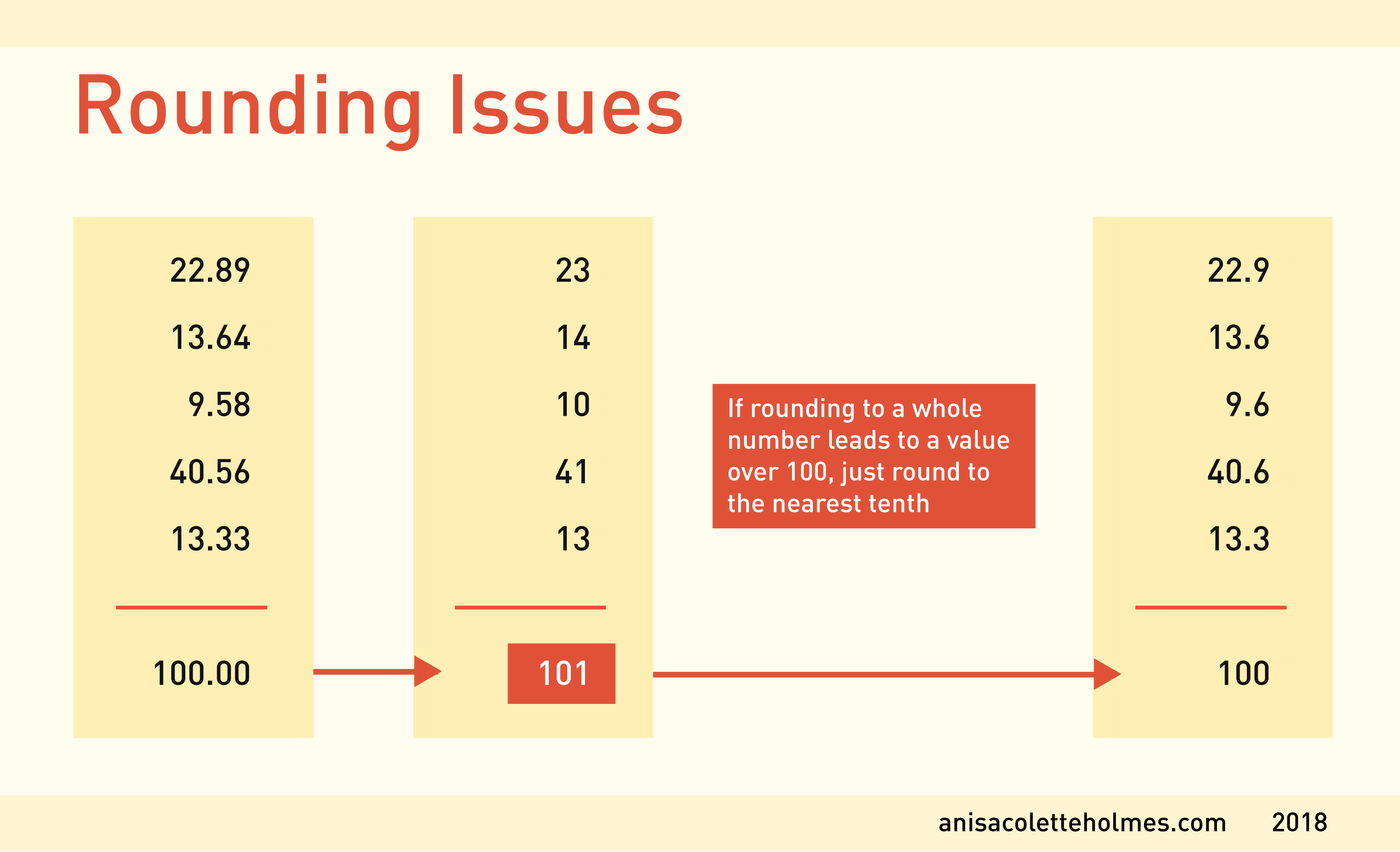
2. Make sure your numbers add up
It goes without saying that you should double, even triple check your data before finalizing your corresponding visualization. And, if you’re visualizing a composition, like a pie chart, make sure your values add up to 100%.

Also, remember that occasionally, even when your data is accurate, rounding to the nearest whole number can lead to a total sum of over 100. In that case, just round your values to the nearest 10th to avoid confusion.
3. Check your chart axes, labels and intervals
Label your axes for maximum clarity and readability. Inconsistent labels and intervals can be extremely misleading for readers.
This graph from USA Today seems to show that the number of Americans receiving federal welfare is skyrocketing. Closer inspection shows the Y-axis is cropped to start at 94 million, creating a distortion.

4. Annotate your graph when necessary
If your data visualization is more complex, annotation can be tremendously useful. Is there something noticeable that bears further explanation or scrutiny? Point it out on your graph to provide readers with a bit of extra context.
For example, in this dataset, data from November 16th is missing. Without pointing out the absent data, the reader would assume the value was simply 0 on that day.

Annotation on makes this graph by FiveThirtyEight more intuitive, which means that we don’t even need a legend.

Also, always remember to include your data source!
5. Balance aesthetics and functionality
Aesthetics and form should work hand in hand to complement each other, rather than to distract. So, if you’re making a chart that compares the growth rate of apple trees to orange trees, you probably shouldn’t color code the orange trees with red and the apple trees with orange. Keep it simple.
6. Do a squint test
Consider hierarchy first. Do a squint test – squint your eyes and see what part of your graph pops out first. If the graph is well designed, the main trend of the graph should be the first thing to grab your attention, even when the image is blurred. Any extra elements or design flourishes that detract from the central message should be diminished or removed altogether.

Next, consider readability. Is your color scheme simple and easy on the eyes? Try picking two key colors, and add additional colors by either lightening or darkening the originals. Or, if you need several colors, try this palette generator for ideas. Additionally, try to pick a simple, sans-serif font for easy readability on screens.
7. Get a second opinion
When in doubt, ask a friend for their opinion. Sometimes you are so deep in your project that the most obvious of mistakes completely escape your notice!
Any questions? Feel free to tweet me at @a_c_holmes!